August 2017

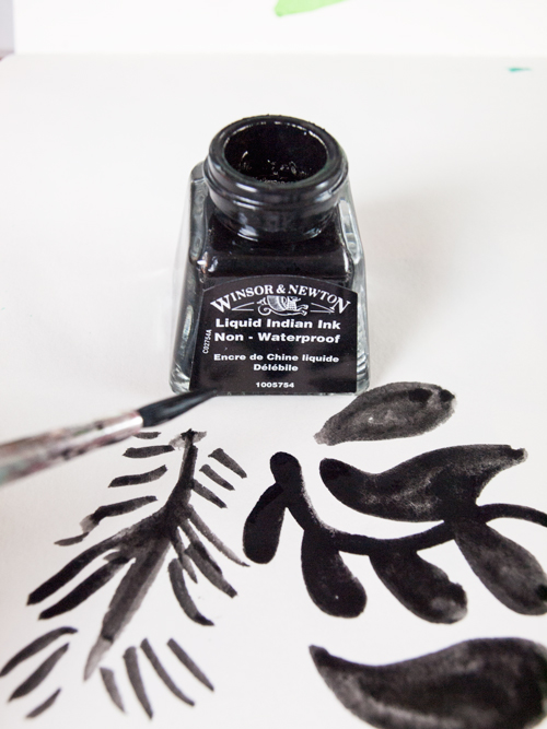
Hello all! I’d love to share with you some new work, which I’m very pleased with how it’s turned out. I’ve been busy making new drawings so that I can use them as textures for new pieces of work. I absolutely love, love, love using drawing inks at the moment- I just can’t get enough of it! Oh, and I also started driving again as I really need to get on with it… I worked out that it’s been 10 years since I had my very first driving lessons and I’ve not even passed it yet! Well, that’s sort of not true. I took the practical test twice and failed- so I left it as I went to Hong Kong for a couple of months. Anyway, kick up the butt, I’ve started again and I’m determined to pass it!

Here’s what I’ve been doing:

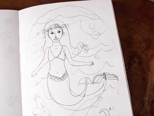
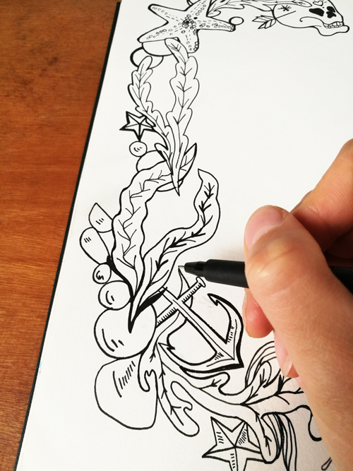
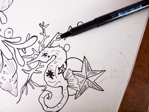
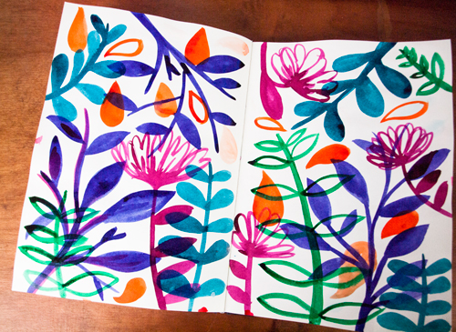
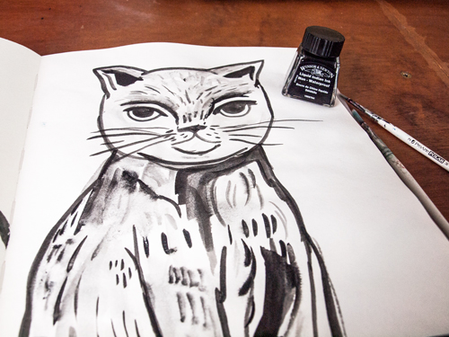
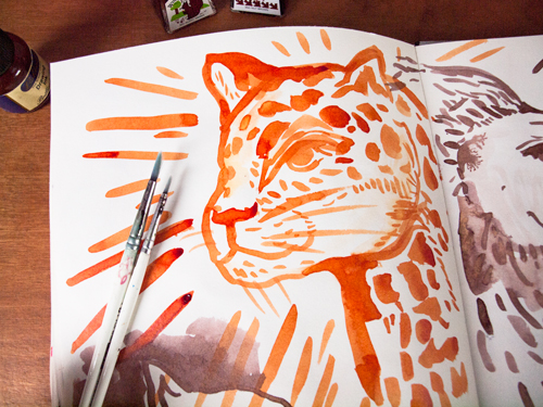
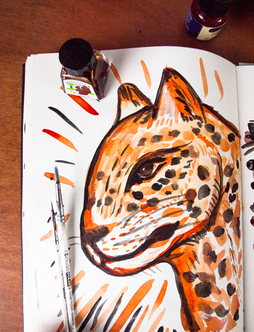
I shared some images of my sketchbook over on Twitter and I made loads of new random drawings over the past couple of days. Sort of abstract, crazy squiggles of plants!

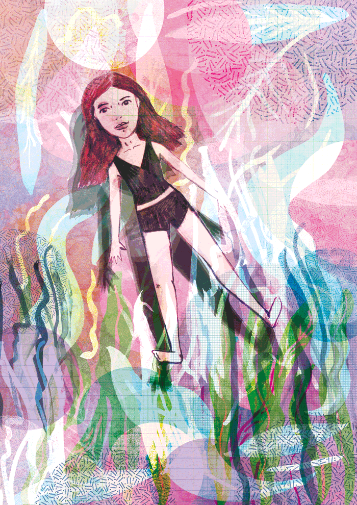
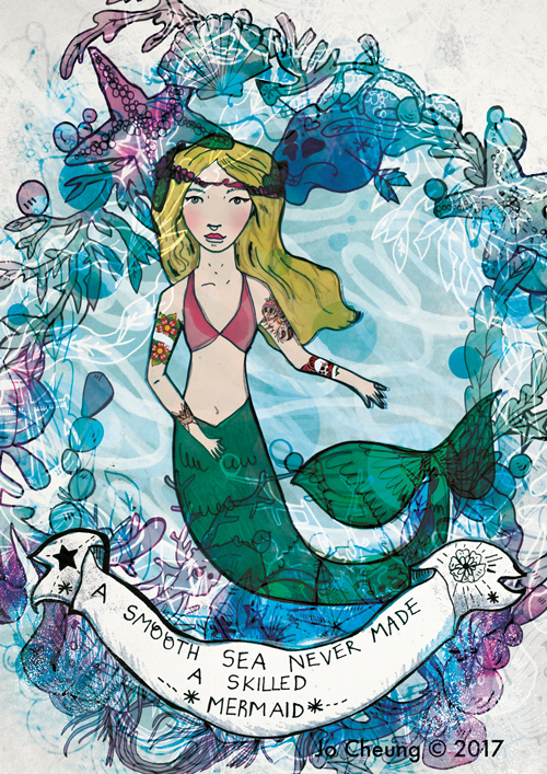
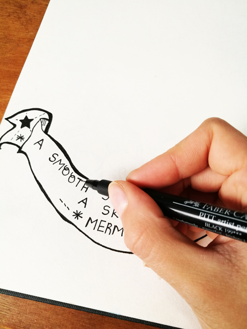
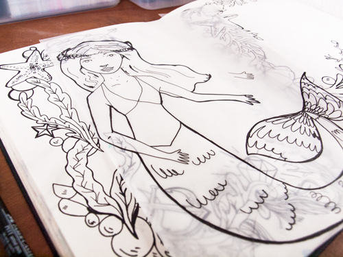
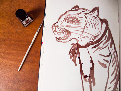
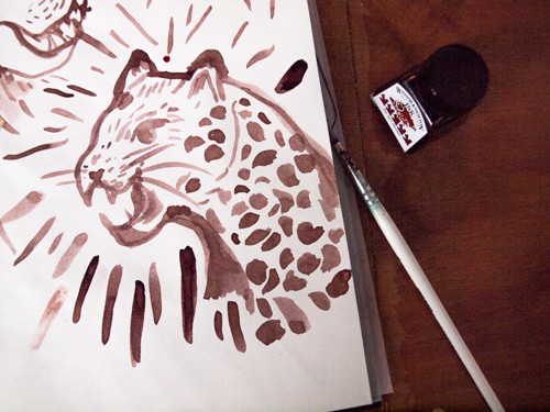
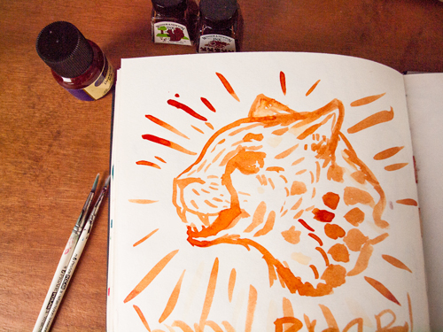
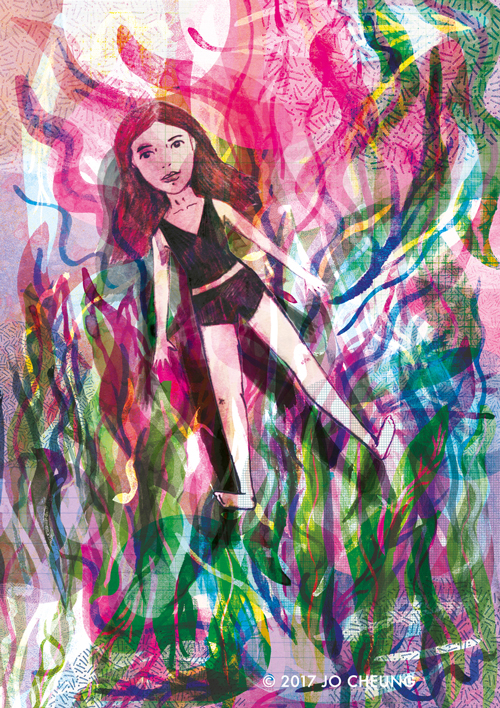
Then, out of all the drawings I scanned in and started to use them as a background for a new piece of work. I decided to try something out that’s slightly out of my comfort zone. Dun, dun, DUN! NO ANIMALS OR BIRDS! Yup, that’s right. I wanted to start incorporating more people into my work as I feel that’s the weakest part of my drawings skills. I’ve drawn people in the past, but I want to move away from the line drawings which I normally do and use pencils instead. I spent about two days on it as I kept on going back on forth with it. When I can’t creatively solve a problem I’ll actually take a break from it for a couple of hours and revisit again or at a later date.

After a lot of editing and trialling things out, such as different positions of the figure, here’s the final image. Or should I say ‘images’ as I’m not sure which I like the most!

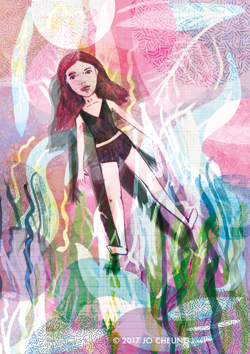
Now looking at all the images together, I think I prefer version 2. What do you think? Which one do you like? Or do you think that there’s anything else I can work on? I’d love to get your feedback!

Thanks for reading my post and I hope you have a lovely Bank Holiday weekend!

EDIT: Alrighty. So after even more faffing around (just because I’m so good at it) I decided that I’m going to keep all three images and make a triptych titled ‘Floating’

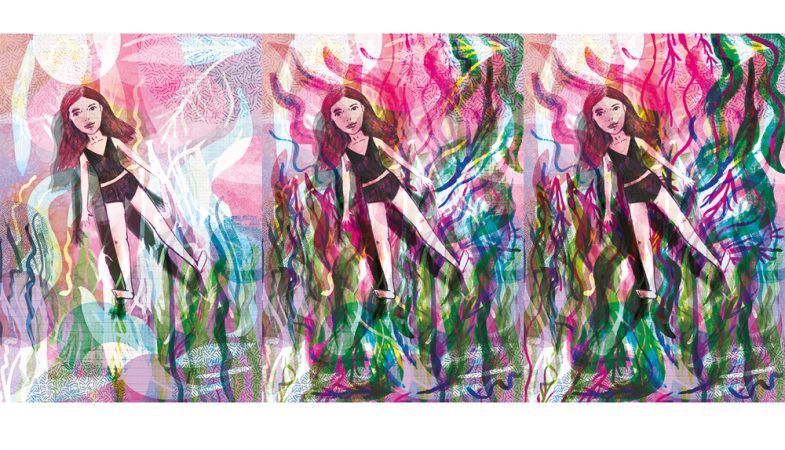
Sorry that the image quality is a bit rubbish but I can’t seem to save a higher resolution of it as well as having it 500px wide so that it can fit into the blog post… That aside, I made a gif using the three images!

It’s not often I draw mermaids, actually, I’ve never drawn a mermaid before! My cousin Savina got in touch with me as she wanted an art print for her friends birthday. I really enjoyed making the illustration and I would love to do another illustration similar to this in the future!

I thought I would share with you the initial design processes until the final image as I don’t think I’ve ever written about it. There are no photos of how chaotic my work desk can get though! I like the chaotic mess though; I was never a super tidy person to begin with as I sort of thrive from it. By the way, I am a very neat and organised person in general and our house is tidy if you ever do come round!

1. Sketching Down My Ideas

I’ll always start with a rough sketch in my sketchbook so that I can visualise all the parts I need to draw out. I like to draw things in parts- don’t as me why- but I just do! It’s probably so that I can easily redraw a new part without having to sketch the whole thing out again. Savina had already told me what she wanted, which was obviously great, so all I had to do was plan it all out as well as decide what the colour scheme was going to be. I usually work with one sketch and I’ll send it to the client so that they can see where it’s going. It’ll be like a proper squiggly drawing- nothing polished as of yet.

The one thing that really helped me was that she sent me some photos of her friend, so from that I wanted to capture her personality through the print itself.

2. The Drawing Stages

I’ll spend quite a lot of time drawing it all out. It can take from 20 minutes to over an hour depending on the level of detailing that needs to go into the drawing. If it’s a collage, which I do as well, it could probably take longer.

With this illustration I drew out the borders separately so that I can spend more time focusing on each section. The bigger the scale of the drawing is the easier it is- does that make sense? So I rarely use an A5 sketchbook unless I’m going out to do some observational drawings. It’s always A4 and A4 forever it shall be!

Anyway, below are two separate drawings of the border and the banner:

Next, I drew out the mermaid but I wasn’t happy with it as she was slightly out of proportions. Also, Savina asked me to tweak it slightly. I drew the mermaid out again onto tracing paper.

3. Editing it on the Computer

Once I’m satisfied with all the elements I’ll then scan them all into Photoshop and then digitally edited it. I’ll spend time changing the layout and trying out different colour combinations. I knew I wanted different shades of pinks, blues and purples so I decided to go for a watercolour effect for a ‘sea’ effect.

Every part of the stages I’d email Savina back to get her feedback. I think it’s especially important to communicate with your client as you’re going and on both sides being clear with the expectations. The mermaid initially had blue hair but Savina asked me to change it to blonde instead which I think it looks a lot better as she looked slightly ‘lost’ with the background.

4. The Final Stage- One Finished Art Print!

And that’s it! Once Savina was happy it I printed it out for her and sent it off. It took over a couple of days to do, bearing in mind each of the stages weren’t done in one go. I made sure I made a note of the time and dates of how long I’d spent on each of the stages.


If you have any questions about anything do get in touch with me. I would love to hear about your creative processes and whether there are any differences or similarities in the way that we work.


I’m available for private commissions so please feel free to email me at [email protected] specifying the occasion, who is it for and any other requirements. Thanks for reading and take care!

Hello, hello! Sorry for the lack of updates as I’m currently on my summer holidays, so I’ve spent much of my time making new artwork and getting my Etsy shop sorted out as it was in need of a new update. It’s been absolutely brilliant having all this time off as it’s means I can concentrate on my art, which I don’t often get!

I thought I’d share with you some of my sketchbook work. If you’re following me over on Instagram you’ll have seen some ink sketches of Mario and more of Mario! I love drawing him; there’s something quite aesthetically pleasing about drawing him! He’s super easy to draw as he lies around all day. Plus, cats rule! I usually don’t work with ink but I gave it a go as I wanted my drawings to be a lot looser and fluid. Don’t get me wrong but I absolutely love drawing with my trusty old pens, however, it’s quite nice to be able to practice using a different medium. So the other day I bought some more Winsor & Newton drawing inks in Veridian and Liquid Indian Ink. I forget how easy they are to use, but not only that, the colours are so intense and vibrant (I don’t always water them down unless I’m layering different colours). I use a paint brush with the inks as I really like the smooth quality you get with it (do use and try out different methods as it depends on what you’re comfortable with using).


Flowers and abstract shapes seems to be a repeating theme throughout my work and I intend to continue with it. I don’t draw from direct observation but instead the process of mark making is more like automatic drawing. So, it’s all from my head basically!

Then I had an obsession with drawing the cats (and it still continues!). I’m not sure with anyone else, but when I’m interested in a subject matter I will literally zone in on it for a couple of days. I like the simplicity of the line drawings as I tried using one colour as a block colour and then drawing the outline with it. But it didn’t look right so I stuck with the line drawings.


Besides the cats I wanted to practice drawing big cats. I was researching Tibetan tigers and Chinese tigers (they looked like they were woodblock prints) as I really love the decorative side to them.

As I said previously about drawing Mario and Toshka, here I decided to add the Indian ink to the drawing (even though I was doubtful at first incase I messed it up). I think it works really well as the black is still quite soft and not too dominant. 

… and that’s about it. Now I need to go out and buy another sketchbook as I’ve finished it!

I’ll post some more progress photos as I’m going (when I buy a new sketchbook). I hope you’ve enjoyed reading this post and feel free to comment below on your own experiences of using Winsor & Newton inks. Or if you have any other recommendations, painting/drawing techniques I’d love to hear from you!

Thanks again and have a super Monday!